|
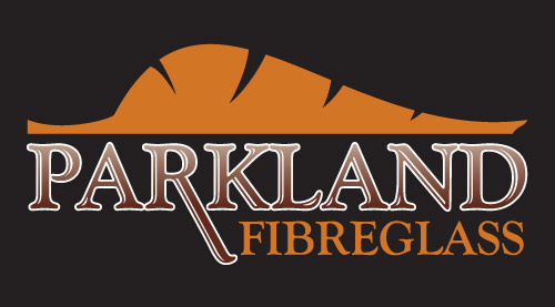
Parkland Fibreglass is an Alberta-based company producing high-end fibreglass materials.
In designing this logo I intended for the top shape to represent a leaf, relating the natural theme with the company name. I also wanted the shape to look like a rolling
hillside, similar to the rolling Alberta hills. Finally, I added the "stripes" to the shape to both look more like a leaf, but also to be reminiscent of a tiger's stripes, for strength.
I selected the font to indicate formality and a sense of dignity. The descender on the R was lowered to give a flow toward the Fibreglass text, and also symbolising the company's Albertan roots.
This was done as part of my work at Raptor Studios.
<-- Back to my logo portfolio.
|
|
|
|
|
|