|
How could I not be honoured when a marketing agency chose me to create their logo?
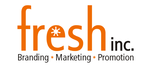
After meeting with the lovely ladies who founded Fresh Inc., I went to work on creating a logo that not only reflected on their business, but I thought about the two of them as well. The logo is crisp and clean - it's fresh!
The detail in the "e", and repeated as the bullets below symbolizes the growth and uniqueness of Fresh Inc. It is also used as the main component of their secondary logo, which then has the text featured within it.
<-- Back to my logo portfolio.
|
|
|
|
|
|