|
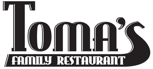
I know, you're thinking "Hey dude, where's the colour?" - Well, there isn't any. This logo is for my dad's restaurant, and one thing you should know about my dad - he's a pretty simple guy (in the best of ways). He likes black and white, meat and potatoes, straight up honesty. So when I built his logo, I went for that approach. The restaurant is right on the side of the highway, so he needed a logo that was simple and bold, easily read by people travelling at 60km/hr (he's just on the outskirts of the wee town of Hixon - I know, "Where?" Small town, smaaalll town BC. OK?
If you're ever travelling through central/northern BC, stop by and tell him you heard about him on the internet. It'll creep the heck out of him. Go ahead and try the Big Kahuna Burger - if you can finish it all within an hour, it's free (Good luck).
<-- Back to my logo portfolio.
|
|
|
|
|
|